Color theory – a little physics for the artist
For me color theory was always a boring topic. With my background as a lab technician I knew about the wavelengths of light and how the eye perceives color. But this did not help me learning to see and mix color. But here are the basics:
There are different types of color models and most of them are organized in a circle. Color is a visual sensation of electro magnetic waves. The eye is the organ that is able to perceive these wavelengths. The eye perceives waves which have wavelengths between 380 nanometers and 780 nanometers. Between these wavelengths we can see every color – starting with violet at the low wavelengths up to red at the high wavelengths with every color in between.
This explanation makes clear that a true color model is not circular but rather linear – wavelengths decrease or increase and become invisible for the eye. But we also notice that both ends – violett and red – are very similar and can indeed go from one to another.
Now to the practical part for mixing colors on your palette. (Here I show you a low budget glass palette with which you can place color chips beneath to make matching colors much easier).
The Munsell color system
The Munsell color system is the most logical color system – forget about other color systems. It defines colors by Hue (red, yellow, blue, green, blue-green, yellow-red ect.), Value (the lightness of a color; starting at 0 for a perfect black up to 10 for a perfect white – both can`t be represented by tube paints), and Chroma (purity of a color; the lower the chroma the more it tends to a neutral grey).
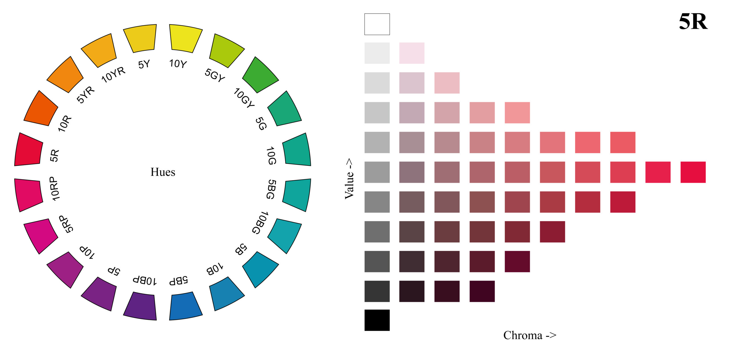
The right hand side of the picture above is an example of only one hue – 5R. You can use this handy online-tool Virtual Munsell Color Wheel. Keep in mind that trying to mix a screen color with paint is impossible which makes a big difference in perceiving color. But for a general impression it is what you’ll need in your atelier. Actually there are more hues than in the image above – each hue is divided by 2.5, 5, 7.5 and 10.
The original Munsell Book of Color* is very pricey but has over 1600 standardized color chips, the New Munsell Student Color Set* has too few chips to be helful in your atelier at home but is an affordable introduction to the concept of the Munsell system.
If you would like to know how you can save hundreds of dollars on color charts just like those from the Munsell Book of Color click here: Hue | Value | Chroma – Munsell Color Charts for Artists – eBook
Exercises for judging colors
Now that you know about the three different properties of color try to judge colors that you see by these three properties.

This color definetly is neither blue nor green. Is it red? Yes a little bit. Is it also yellow? A little bit too. So it must be a yellow-red or simply orange. But it is not a pure yellow-red. The chroma is neither neutral/grey nor full strenght. It’s lightness is about half dark and half light – so it’s about value 5 or so.
In fact this color is 2.5YR 6/6 in the Munsell Notation System which means a yellow-orange hue of 2.5, a value of 6 with a chroma of 6.
In case to match this particular color mix a pile of yellow and red (for example Cadium Yellow and Cadmium Red) to a strong chromatic orange. Now come the Munsell neutrals in handy. How to mix neutrals and store mixtures in bulk can be read here).
Take your Value 6 Neutral and mix the orange in. Not too much at first to judge the needed portion for going another step to more chroma. Our original orange mix also has a value of about 6 so the lightness of the neutral-orange mix won’t change. Now you can move closer to your target color by playing with yellow, red or neutral.
Keep in mind that trying to mix a screen color with paint is impossible. The reason is the difference between color perception. Screen color is additive color and pigment color is subtractive color.
Natural colors – “for black and for white, for yellow and red ones”

Most of the colors that we see in nature are low chroma colors (read this excellent analysis on the blog “Muddy Colors”). Most skin tones fall into a small range between the reds and yellow-reds at less than chroma 4. Take a look at the painting by Léon Bazile Perrault on the left.
Luckily these colors can easily achieved with earth colors like Yellow Ochre, raw and burnt Sienna as well as raw and burnt Umber plus White and Black. The painter Anders Zorn used only a few colours and was nevertheless known for his lively portraits.
Mark Carder also uses only few colors for his lifelike paintings. Watch his video on his approach to color mixing by clicking here.
Further information about the Munsell Color System:
Munsell color theory for Artists:
- The Dimensions of Color – by Dr David. J.C. Briggs | This is THE RESSOURCE for color in the internet for artists.
- Color Theory Simulation – Online tool & exercises
- Color IQ Test – Test your color vision with this online tool
- Here’s a little game for you to learn about Hue, Value and Chroma: Eye Q Test 1 Eye Q Test 2
- Free eBook (Public Domain) – “A Color Notation” by Albert H. Munsell (different file formats; Project Gutenberg)
Workshops/Exercises
- “Demystifying color theory“ – Detailed descripton of a Munsell workshop by Graydon Parrish with insights into exercises to master color mixing.
- Carrol Lamberts attended a Munsell workshop by Graydon Parrish and wrote a review about her experiences and the exercises
- Artist Gregory Mortensen shows his approach to working with a Munsell system palette for portraits.
- Munsell Color System explained on figure painting.
- The importance of a neutral light source – Learn more on studio lights.
Video instructions
Color mixing principles
Paul Foxton (www.learning-to-see.co.uk) talks in this video about general color mixing principles and how to get the realistic look. This video is from this great post “A Blue Lemon: Why Understanding Colour is the Key to Realism“. Read how Paul painted a realistic appearing blue lemon by controlling color with Munsell.
Make sure to check out his website where he gives inspiration and practical advice for aspiring realist artists. He also offers courses on color mixing.
Introduction to Munsell
Paul Foxton explains in this video the attributes hue, value and chroma of any color as described in the Munsell color notation system.
Some general advice and how Paul learned about color mixing after Munsell in the post “Colour is Easier to Learn Than You Think: Here’s How“.
Neutrals
Only by mastering values an artist is capable of greating a realistic looking image. Watch how Paul Foxton paints a still life with simple shaped objects just in tones of grey and how he makes a realistic representation of the still life – just without color.
A two part video: Mixing neutrals Exercise – Making a value scale Part 1, Part 2 (YouTube) Matching a Munsell neutral chip (Vimeo)
Matching a specific color
See how a specific given color (5GY) is mixed. First comes the value of the color then the hue and eventually the chroma will be adjusted in the mixing process.
Read in the post “Three Simple Steps to Mixing Any Colour You Need” how Paul is mixing a skin tone from start to finish with detailed step by step explanation.
Matching colors
Watch this quick demonstration of how to mix the color of a lemon.
Hue | Value | Chroma – Munsell Color Charts for Artists – eBook
Print your own Munsell Color Reference Charts at home on your desktop inkjet printer!
- Based on Albert Munsell’s color notation system with 40 hues
- 1,450 color swatches with individual Hue, Value, Chroma number
- Learn identifying the properties of color with the exercises & tools
- Cost effective alternative for industry standardized color charts and decks
€12,90

- Reed, Ron (Author)
- English (Publication Language)
- 180 Pages - 01/14/2021 (Publication Date) - Fairchild Books (Publisher)

- The Munsell Book of Color, Glossy Edition, is the portable guide to communicate color anywhere!
- Includes the full range of colors that make up the Munsell Color Order System with notations to describe every color by its Hue, Value, and Chroma.
- Ideal for anyone working with color from design through production, particularly in Industrial, Scientific and Government applications.
- Assembled in one, easy-to-navigate bound volume, this book includes a brief tutorial on how to use the Munsell Color System with graphics to show exactly where each color exists in the larger Munsell Color Space.
- The Glossy Edition contains over 1,600 removable color samples on 40 constant-hue pages. Single 3.5" 3-ring binder is 13.75" (L) x 4" (W) x 11.75" (T). Matte Edition sold separately.
* Last update on 2024-04-26 / Affiliate links / Images from Amazon Product Advertising API
Hi
Just wanted to know what was the colour palette used by the old masters….
thanks
Good Day,
I was wondering if I missed 3 on the “Farnsworth Munsell 100 Hue Test” what is my score, a bit confused, as the high score for my age group was 162? out of what, 200? I am not sure how to get the percentage? I too am a bit disappointed with my score (and would have loved to know where I didn’t get the colors correct), I was hoping for 100 thinking because I grew up playing in my grandfathers paint store/factory and being around color all my life, along with when I go to the store to out pick color to match something at home or for a friend I can match the color perfectly in fact my designer friends are amazed….I thank you for your website and look forward to learning more and improving in my passion for painting, also knowing how to get my score on the test mentioned above.
Thank you – best regards, DanaC
I am looking to work on the theory that different hues have different strengths and so should occupy more or less space around the wheel, whilst still being split into the 10 hue factions. Mixing paint colours can be scientifically and mathematically calculated in this way. This theory must also apply to the colours of light eg. Blue is a dominant atmospheric colour in a landscape due to refraction through water molecules in the atmosphere.
Another theory would be to include the existing hue portion numbers 1-10 into an algebraic equation based upon a percentage of strength or weekness of each colour hue, value and saturation.
Munsell 101 for the artist this information is very helpful for me! Thank you so much for sharing all information. And if anyone has color blindness problem then visit here and test your eyes.